Even though these default word processors seem fairly basic, I’ve found that, at least with Apple Pages, I have everything I need to typeset a book (excluding a few really niche features). This means beautifully typeset books can be made by most anyone, not just those who can fork over money for professional word processors!
This article will primarily walk through all the settings and steps I use to get a document into a standard “book format.”
1. Setting Up a New Document
Open up Pages and create a new blank document.
Document settings
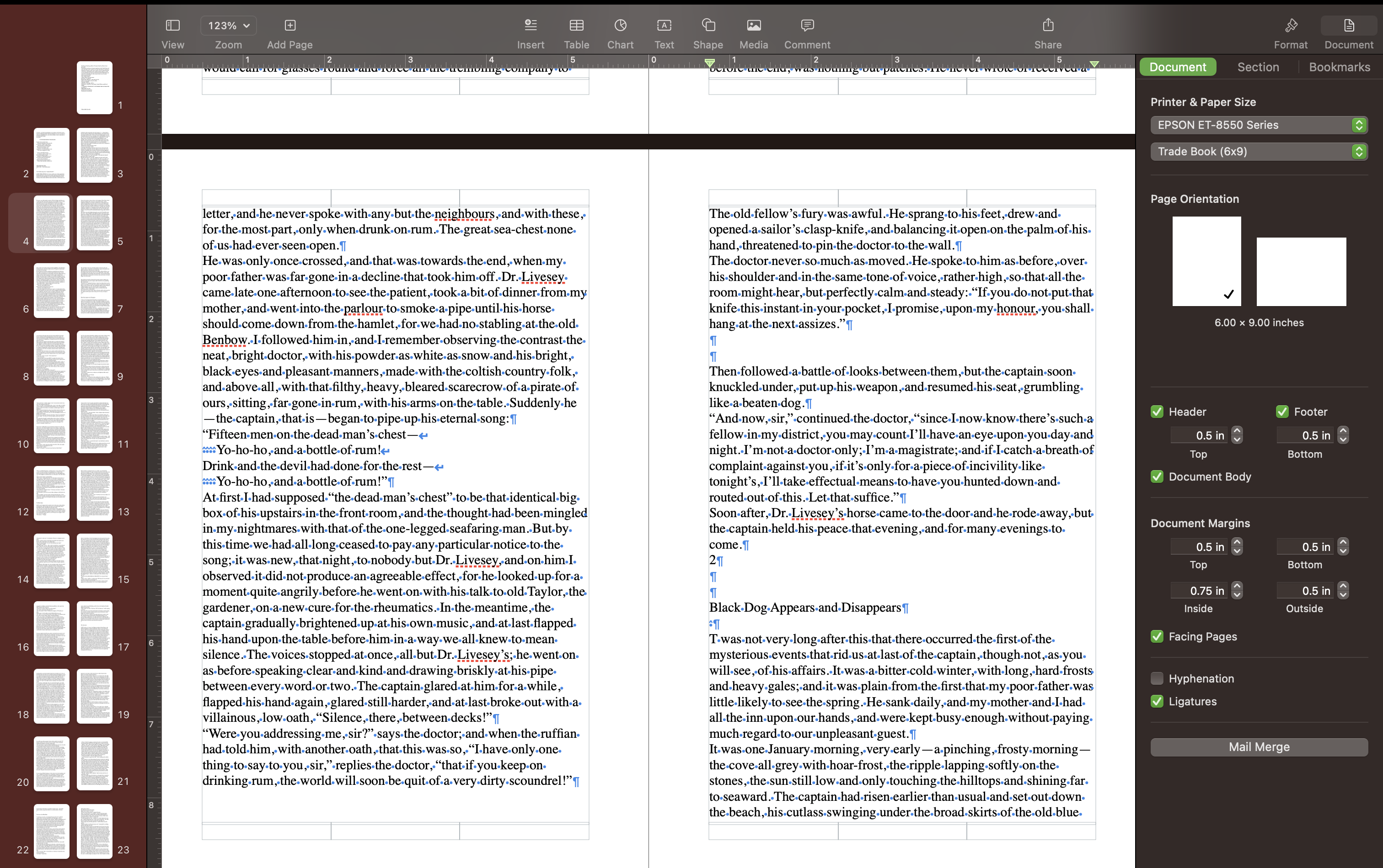
I like to make sure that the document preview is set up to reflect how the book will look when printed. This includes adjusting the page size and the margins and making sure that I have the “facing pages” options selected.
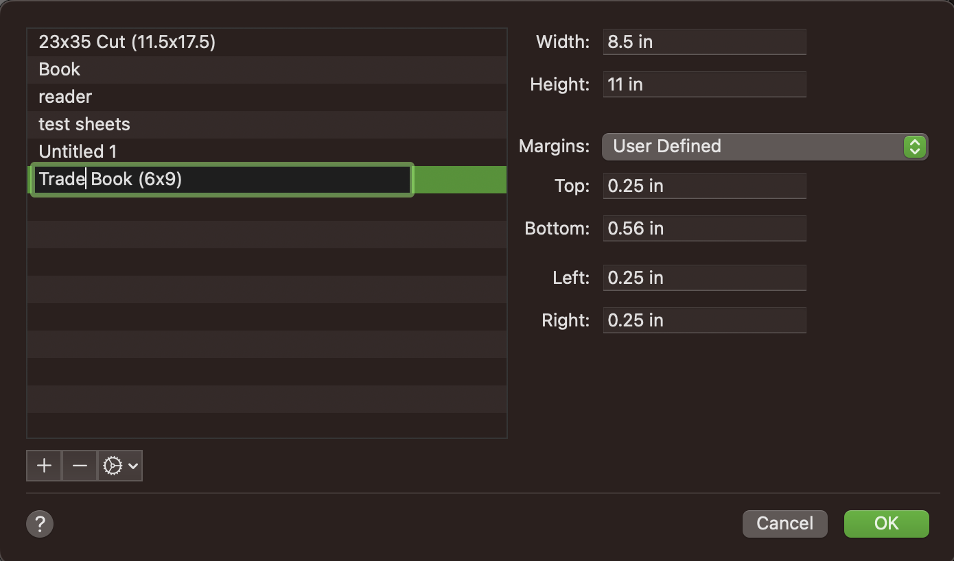
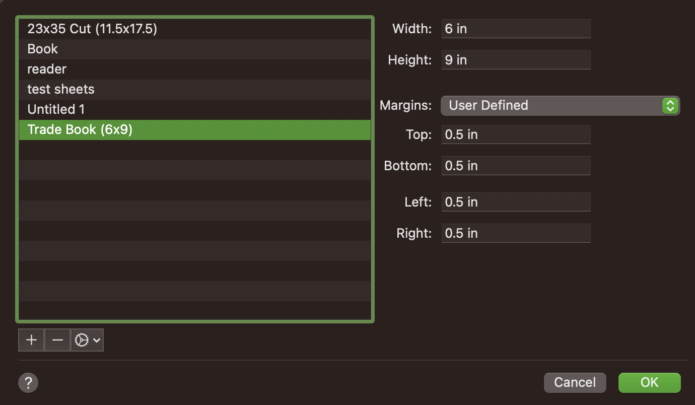
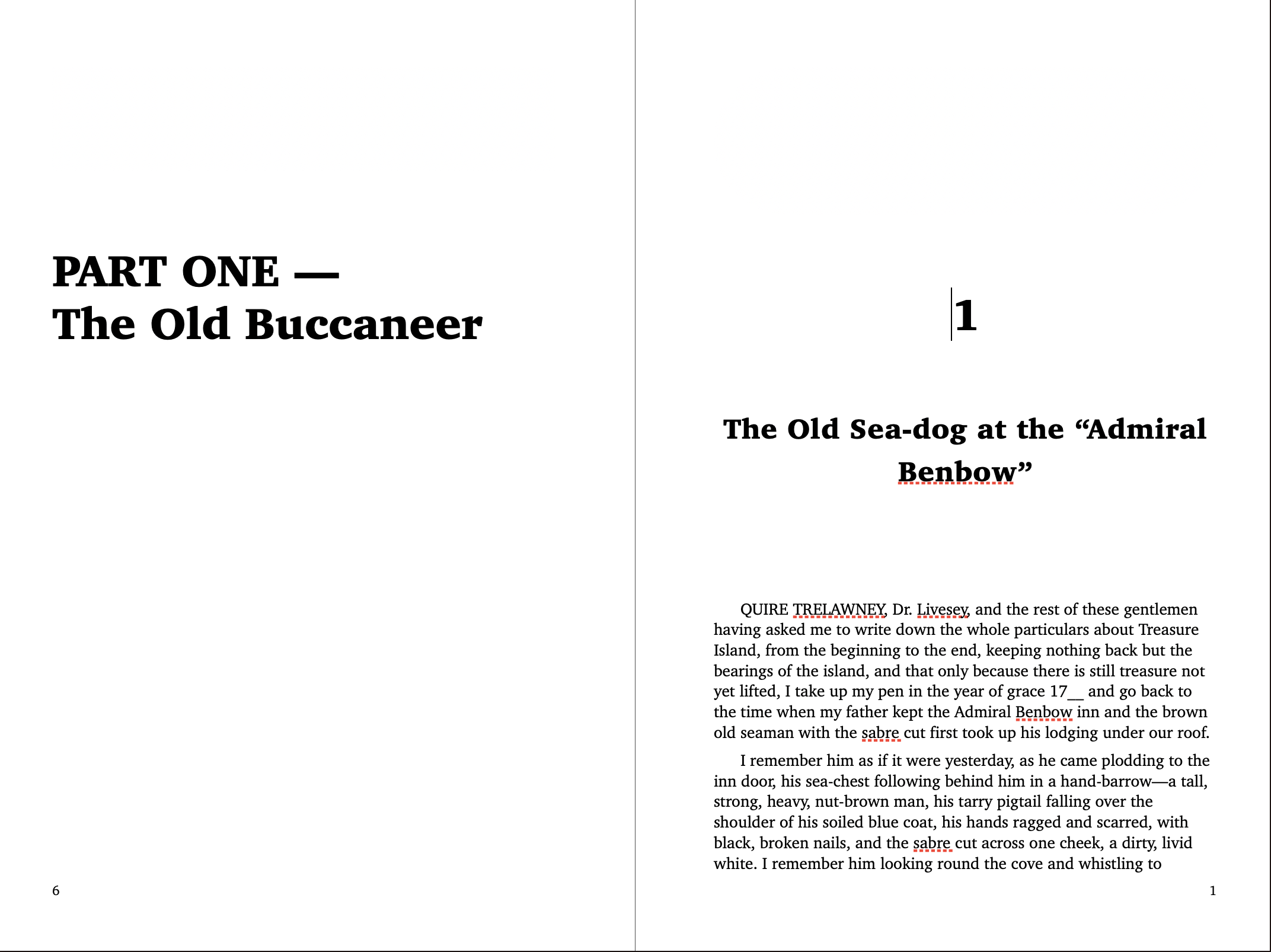
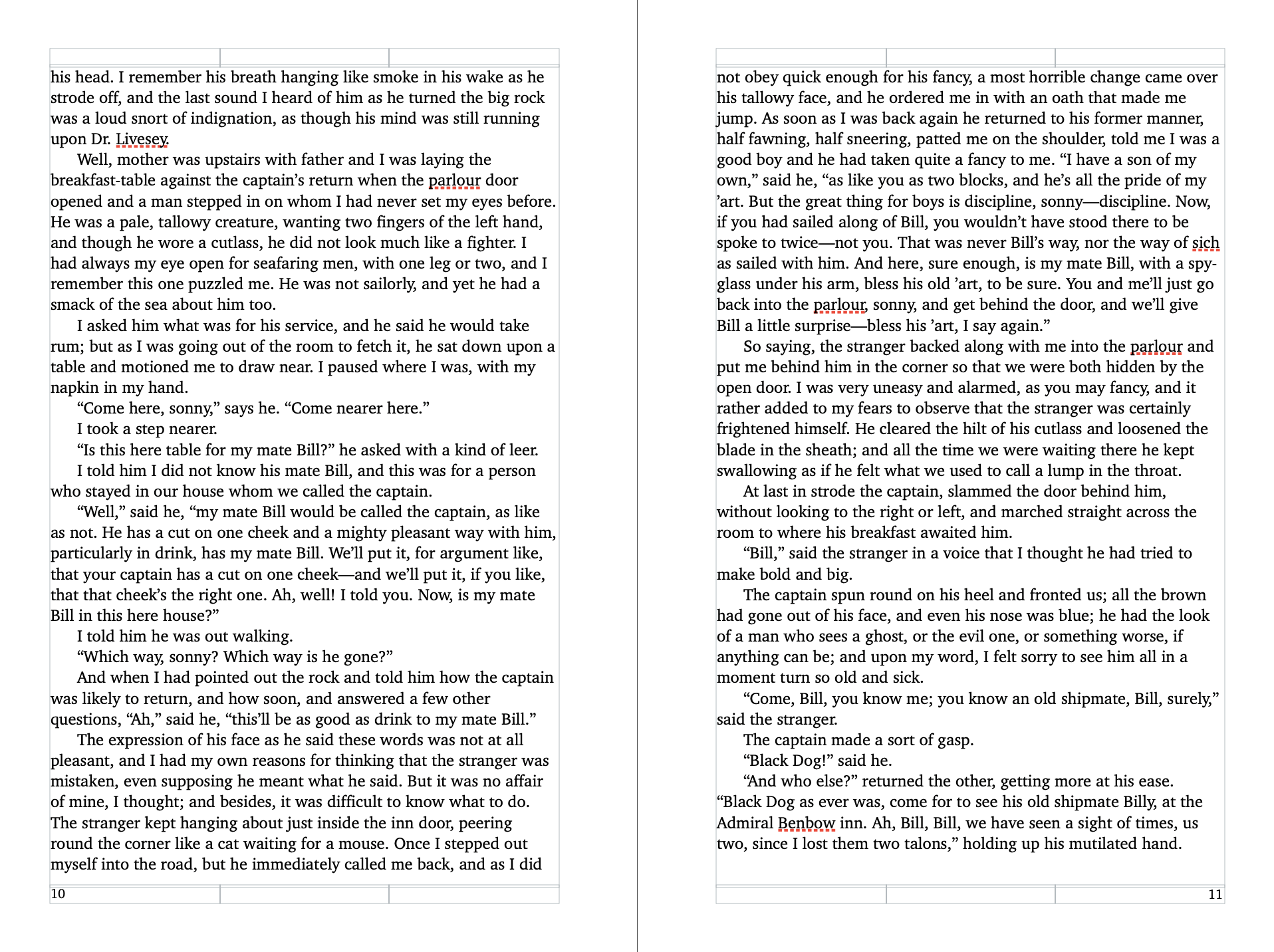
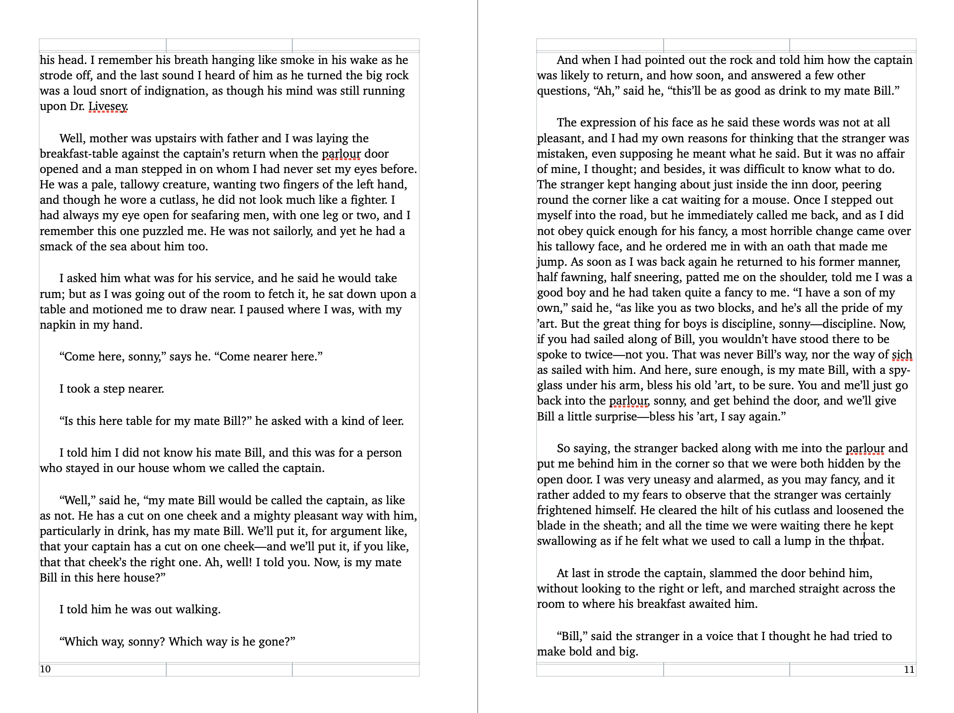
For my example I’m typesetting Treasure Island as a trade book (6"x9"). (Here’s a good article about standard book sizes.)
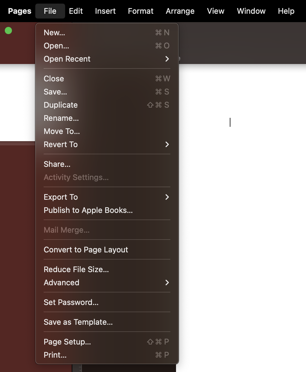
I start by navigating to File > Page Setup. This opens up a dialogue box.
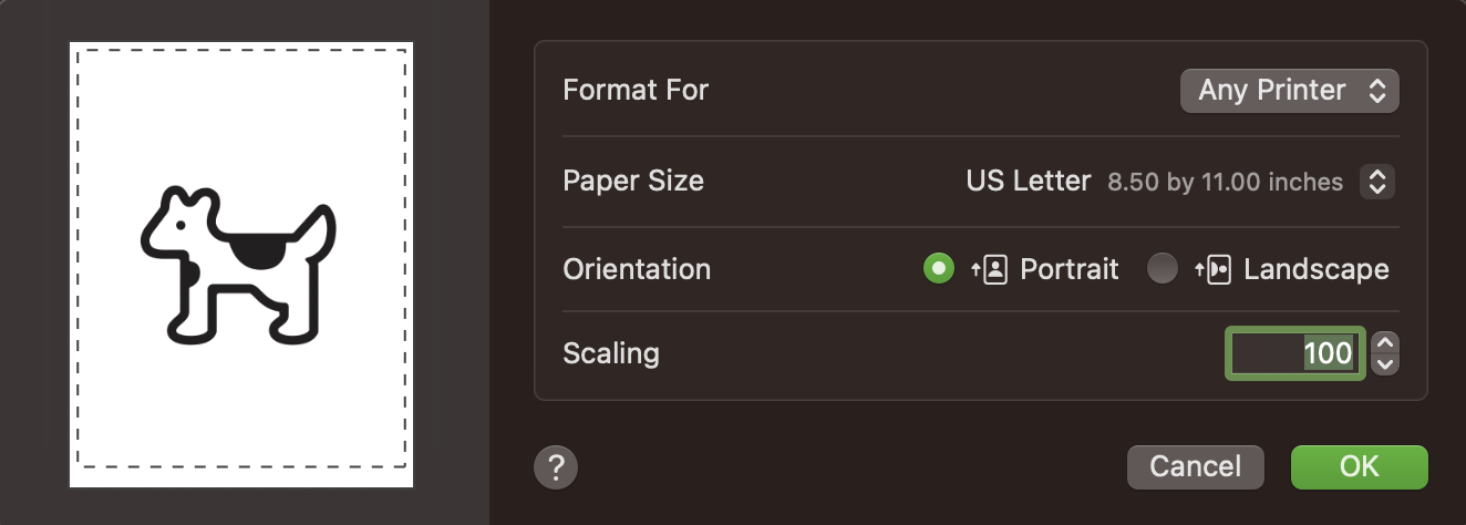
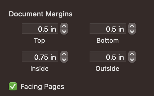
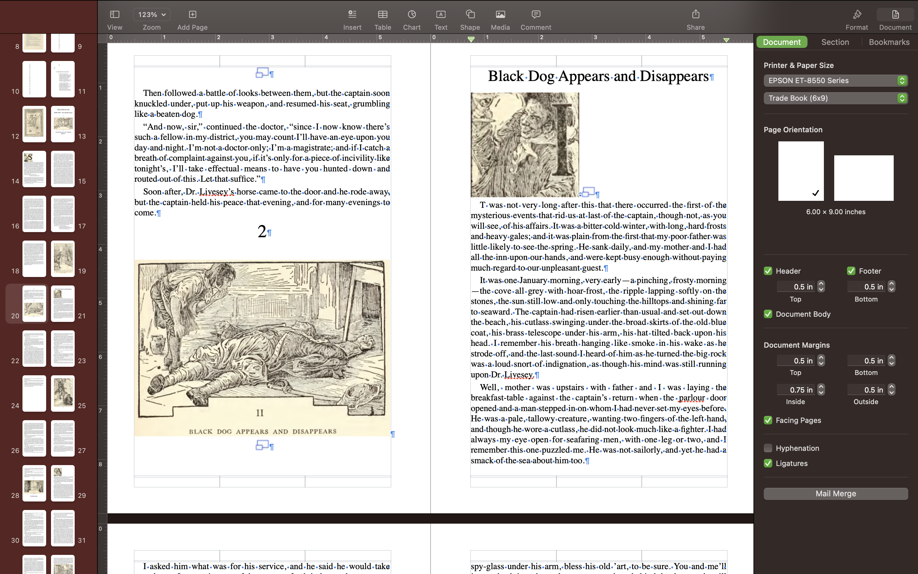
Click on Paper Size > Manage Custom Sizes. This will open up a second dialogue box for adding custom page sizes. This is where I set my new width (6 inches) and height (9 inches) and my margins (0.5 inches all around). Margin sizes can vary based on book size, printer capabilities and personal preference, but 0.5” margins is fairly comfortable for a text-heavy trade book to me. In a later step I will adjust the inner margins to be a little deeper than the outer margins to account for the book gutter when binding.
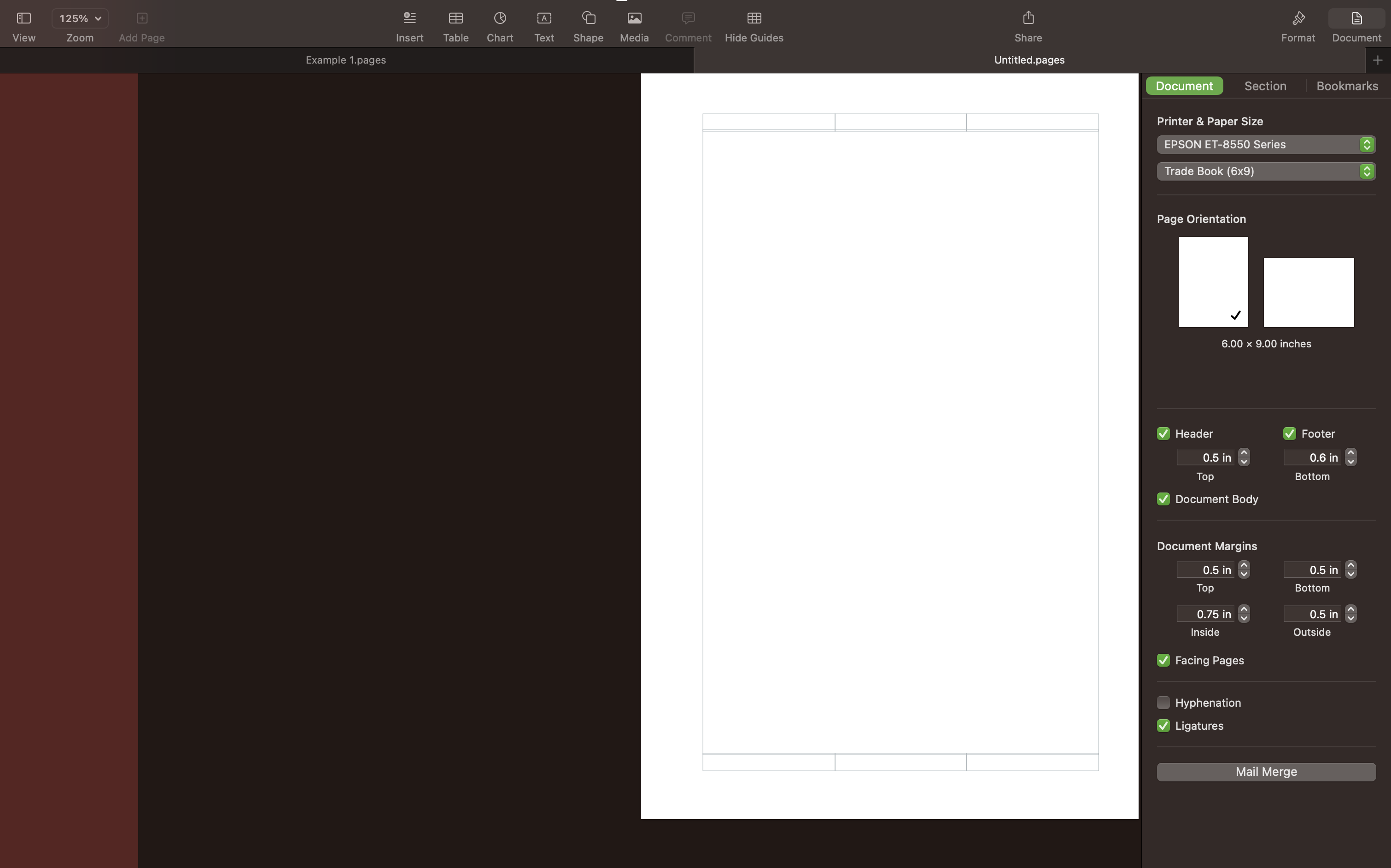
Next, I make sure the pages are set to “Facing Pages.” This makes it much easier to visualize what each spread (this is what the two facing pages are called when viewed together) will look like. This is especially useful if you want imagery that cuts across the center margin and to help layout aesthetically pleasing spreads. Facing pages also makes it possible to set page numbers in the outer corners and change inner margins separately than outer margins.
To turn on “Facing Pages” select the "Document" settings tab in the upper right corner. Make sure the checkbox next to “Facing Pages” is checked.
Then I change the inner margin to be slightly larger than the outer margin, again to leave extra space in the gutter for binding.
Workspace settings
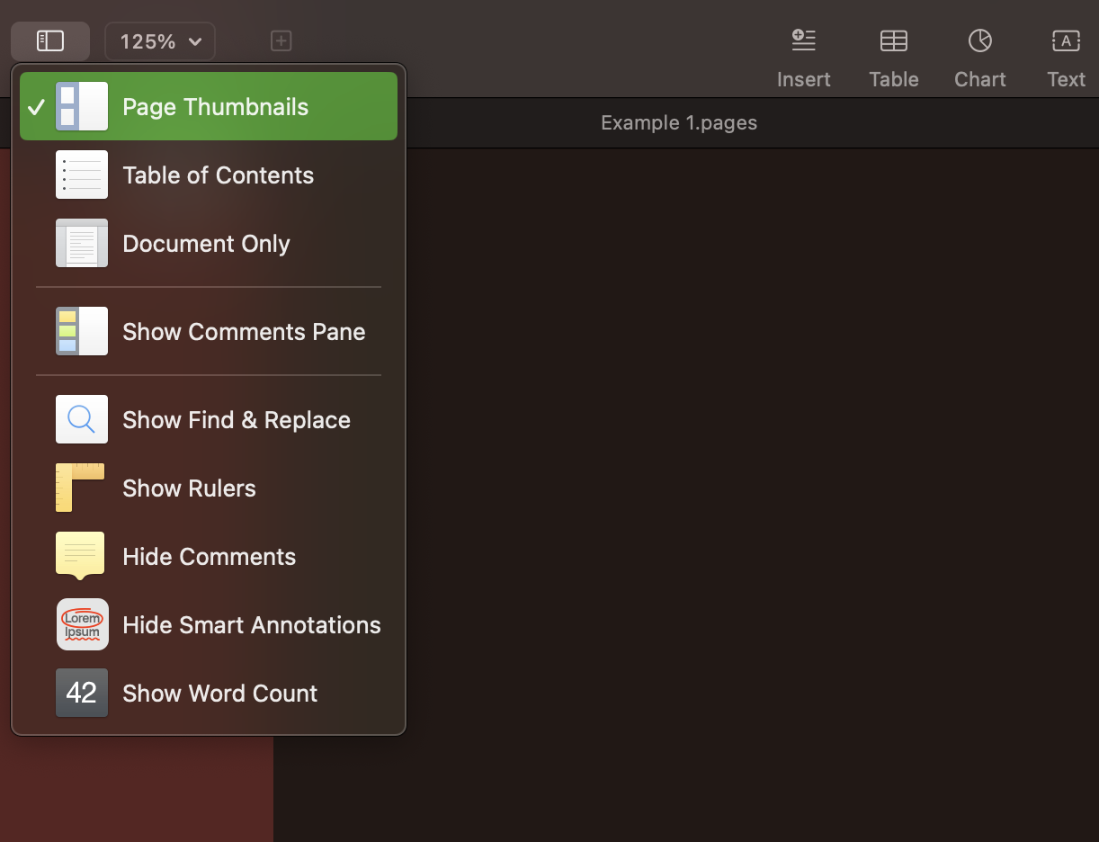
I also like to set up my workspace so that I have all the tools I need for typesetting, this includes showing the thumbnail view and setting “invisibles” (invisible characters like spaces, tabs and returns) and the page layout to be visible.
I turn on thumbnails by clicking on the view icon in the top left corner and checking the Page Thumbnails option. A new drawer should open on the left side of the page with thumbnails of the book.
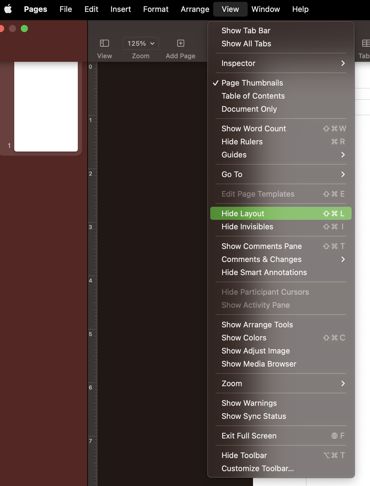
Next, I set the layout to show by navigating to View > Show layout. This will show a light grey box outlining where the margins have been set, as well as the boxes showing the header and footer areas. This makes it much easier to see how close the text is getting to my margins and helps to better manage tabs and white space.
Finally, I set “invisibles” to show by navigating to View > Show invisibles. Invisibles are typed characters that create white space, but no visible character on the page. This would include space, tab, return, column, page breaks, etc. Once invisibles are set to show, there are blue symbols representing each of the different types of invisible spacing characters alongside the regular text. This can be extremely helpful in getting rid of trailing indents and figuring out why text isn’t quite lining up.
While typesetting I frequently switch between showing and hiding the layout and invisibles, to make sure everything looks good without all the extra symbols and lines. I have found that using the shortcuts make flipping between the two much easier. Use
SHIFT+CMD+Lfor toggling the layout andSHIFT+CMD+Ifor toggling the invisible characters.
Adding book text
After I have the document and workspace set up I begin working on the text. I start by copying and pasting in the entire text from start to finish. This includes the book title pages, acknowledgements, everything. For larger books it can take a minute or two for the text to load. When I paste it in I make sure to use the Edit > Paste and Match Style command from the edit drop-down instead of CMD+V.
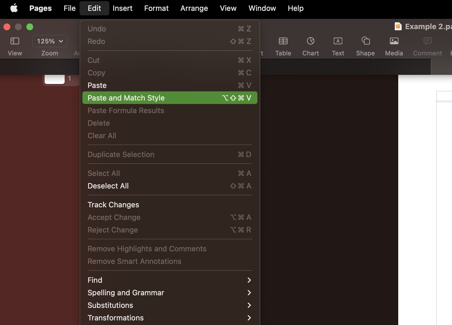
I don’t like having any extraneous styles floating around because it makes it difficult to reformat everything how I’d like it to look. The screenshots below show the difference between pasting the text with the source styles (on the left or top) versus pasting the text and matching the style (on the right or the bottom).
Looking closely at the screenshots above, you can also see the blue invisible characters.
Before and after step 1
Below are images of what Pages looks like right after making a brand new document and what my workspace looks like after completing step 1.
2. Adding in Paragraph Styles
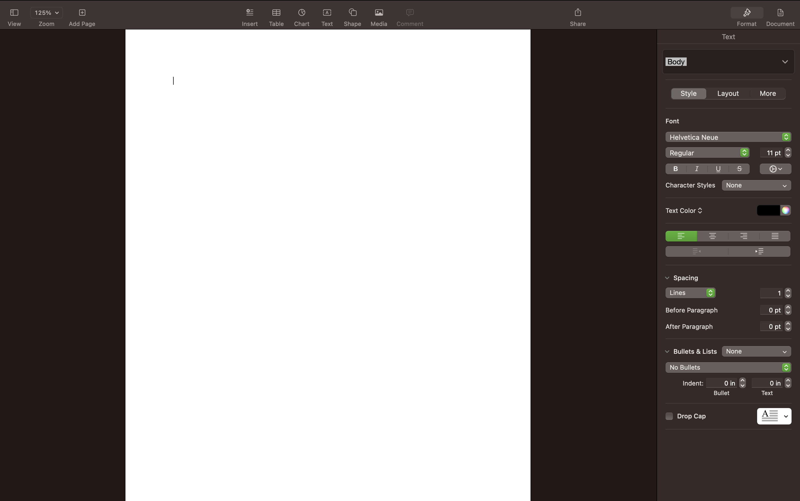
Now I’m ready to start formatting the text. After spending hundreds of hours typesetting books, I’ve realized that the easiest way to change the font, font style, font color, etc. is by using paragraph styles. Paragraph styles allow me to apply fonts, font sizes, colors, bold, italic, etc. to text quickly and consistently. I can also change the presets even after applying them to multiple lines, and when I update the preset, it updates everywhere.
So, for example, I may decide that I want to change the size of the “Heading 2"s. I can highlight any heading that already has the “Heading 2” style applied, make my changes to just that heading, and then click “Update” next to “Heading 2” in the format tab and it will update all of the “Heading 2” text with my changes. No more hours spent hunting down every heading in my 300 page book!
While it may be tedious to go through the entire text applying the paragraph styles, the end result and the hours saved are well worth the effort.
It’s also important to note that using font styles on at least the headings is REQUIRED for automatically generating a table of contents.
My process for applying paragraph styles
I start at the very beginning and work through the book from front to back - it makes it much easier for me to keep track of what has already been formatted vs what needs formatting still. Everything starts with the style set to “Default” which can be seen in the right panel under the Format tab. Clicking on the down arrow opens a drop-down that has the words “title” “header,” “header 1,” etc. all in different styles. By highlighting specific text in my document, like the title of my book, and then clicking the drop-down and selecting the “Title” text, I’m able to apply all the styles associated with the “Title” preset.
At this point I don’t usually bother to change the fonts or sizing quite yet, I’ll just leave the fonts and sizing as is until I apply the styles to a bulk of the text. It just makes it easier to change the styles if I already know how and where they’re going to be used.
Every once in a while I’ll come across a section of text that doesn’t fit into any of the normal paragraph styles. In this case I’ll create a custom one by selecting the text and opening the drop-down like normal, but, instead of clicking on a preset, I’ll hit the little plus button in the top right corner. This will create a new style based on my selected text. I put in a name I want for it and then I can use and update this style just like any other style.
The text from Treasure Island has a good example of where creating a custom style is useful. The text includes several stanzas of song lyrics that I want to appear in italics and left indented deeper than the rest of the text. So, I created a new style specifically for formatting the songs.
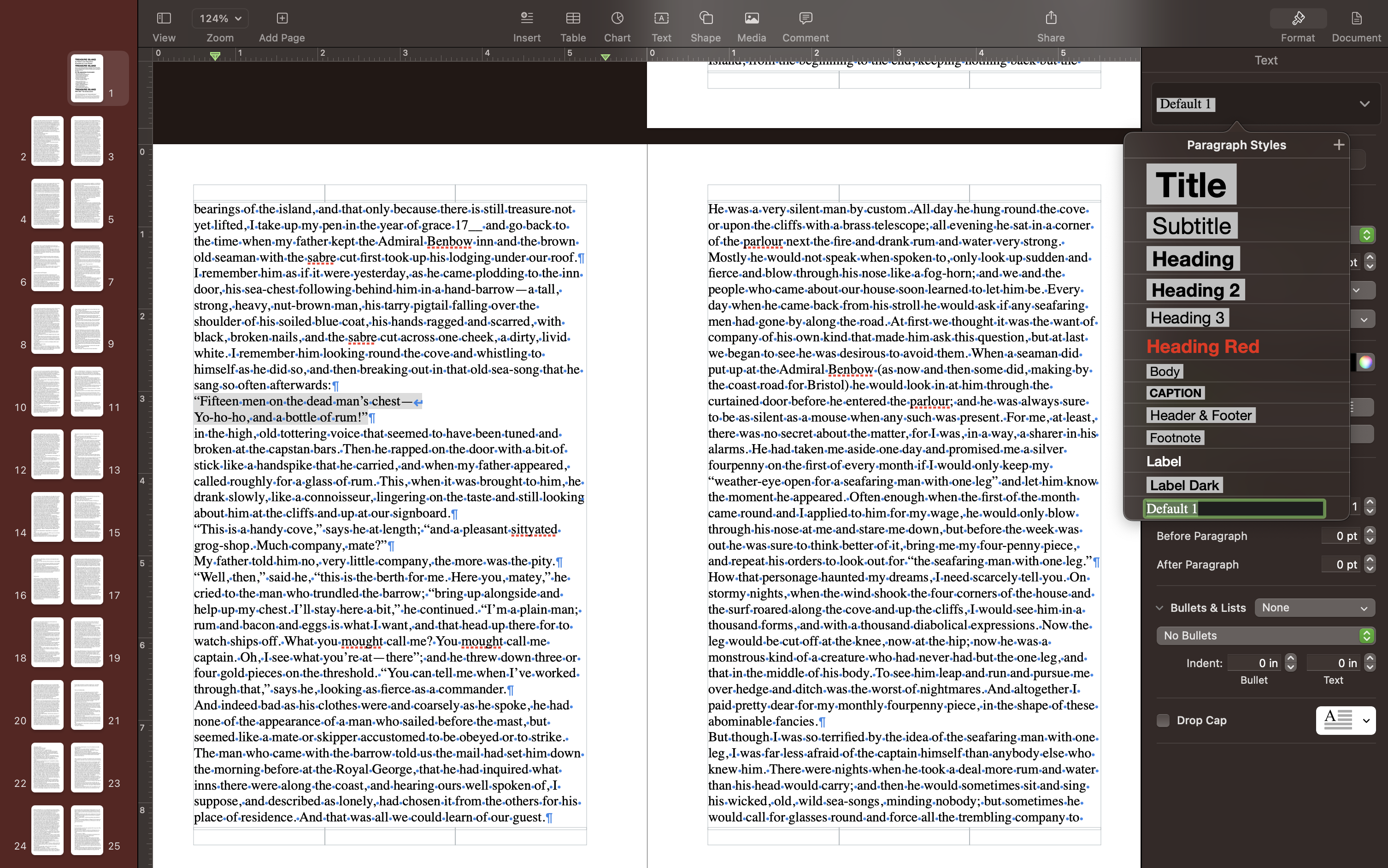
As a rule of thumb, I always create a new custom style for any styles I will use more than once.
Defining styles
I often get bored about a third of the way through applying the styles, so I switch things up by starting to play around with the styles themselves and getting them just right.
Generally, the goal of styling the text should be to get a nice even visual texture across the page which makes for a comfortable reading experience. Well designed titles, sections and headings act as guides so the reader can quickly and easily get their bearings. This is also where I’m really able to set the tone of the book through the fonts I select. Sometimes I spend hours trying to find the right combination of fonts, and I frequently start with one set and decide later it’s just not quite right and switch to a different set.
While each of the following sections could be articles on their own, these are some things I keep in mind when I pick fonts.
Picking fonts
Font styles can define the tone of the text. For example, I probably wouldn’t pick Comic Sans for a murder mystery book or cursive handwriting for a technical book. While these are extreme examples, there are subtle differences as well which I describe below.
For selecting fonts I love using Fontface (only available on Mac). It is amazing and has saved me countless hours randomly selecting fonts from the font browser in Pages. I also love to collect fonts, and I love to buy large font packs (not usually individually) from DesignCuts because their commercial licensing is fantastic. I’ve also come across scenarios where I just want to make my own font, and Calligraphr is a fun tool for this.
For titles and headings: Using a serif font can evoke a historical, pretentious or elevated feel, while sans serif titles feel more modern and elegant. If there is a specific emotion I’m trying to get at, like a horror book, I’ll try and find a unique “display” font that helps convey that emotion.
For paragraphs: It’s standard practice to use a serif font for large blocks of text, especially chapter books. I very, very rarely break this rule and it’s usually for a very specific reason. Picking a font to complement the heading text helps further evoke the emotions I want from my reader. It’s okay to mix serif and San serif fonts between the headers and the paragraphs, again as long as they “fit” together.
When I first started out, I struggled to understand how to find fonts that worked together for the headings and the paragraph text. While experience does help with this, Google Fonts has a plethora of learning resources for how to pick fonts that work well together.
I never pick more than two fonts for 98% of the book. I may throw in one more very unique font for a specific purpose, but otherwise I use one font for all the titles and one font for the body text.
Font sizes
Paragraphs should use font sizes between 8pt and 12pt, 12pt rides the line of being too large and 8pt rides the line of being too small. This also depends on the font - some fonts can be too small or too large, which is why this is a range instead of a fixed number.
Book titles (on the title pages) I usually make large enough that a single line height is at least half an inch of the page and about 80% of the width. That’s just my preference though - I haven’t come across any hard and fast rules on title page design.
Section and chapter titles, I like to be creative with the sizing. Honestly, no hard and fast rules here, I just do whatever looks best. Sections are “heading 1” (like level 1) and the chapter titles are “heading 2” (level 2), and so on down the rest of the headers.
Heading 3 probably won’t typically be used in a chapter book, but will come up in more technical writing. I usually set this to be bold and 2-3 sizes bigger than my paragraph.
Heading 4 is set at the same size as the text and is bolded.
Heading 5 is used seldomly, if ever. When I do use it, I use it like I have in this paragraph of this article - where the first couple of words of the paragraph are bolded but not separated from their paragraph.
Font color
When I’m picking font colors I go for colors that are easy to read and I make sure there is high contrast between the text and the paper color. If I decide I want to print a light color font on a dark background, I’m careful to run several test prints to make sure it prints legibly. In this situation I’ll also size up and even bold the text to make sure it can be read.
Before and after Step 2
Below are images of what Pages looks like right after making a brand new document and what my workspace looks like after completing step 2.
3. Adding page numbers
After adding all the paragraph styles to the text I like to add the page numbers (and in the next step, the table of contents).
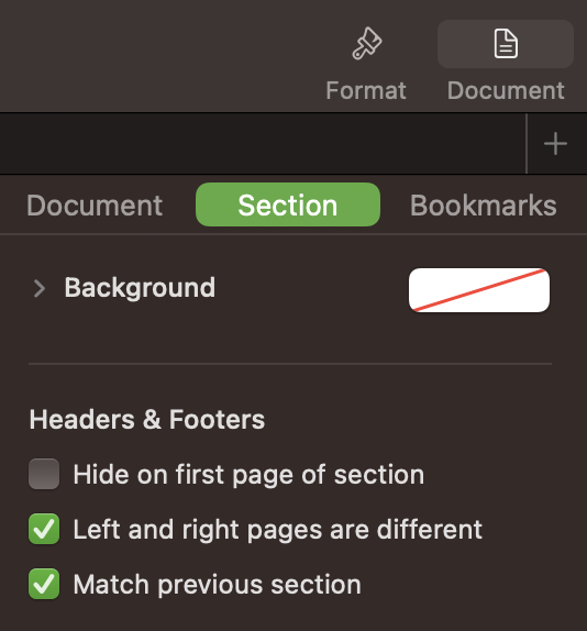
Apple Pages has two settings for headers and footers (where we will be placing the page numbers) where facing pages can have the same settings or where the left and right are different.
For centering the page numbers, the left and right pages can be left the same. When you make changes to one side or the other, the change will be made across all pages. Pick any page, select the footer and click insert page number in the center box. It will now show up on all your pages.
However, to have the pages numbers show up in outer or inner corners, the left and right pages must be different. Now when a change is made to a left page header or footer, it will only change all the left pages, and same when making changes to the right page. Pick any left page, select the footer and click insert page number on the corner box. Notice that a page number shows up now, but only for the left pages. Repeat the steps for the right side.
This can be toggled by navigating to Document > Section > Headers & Footers and checking or unchecking the checkbox next to the Left and right pages are different setting.
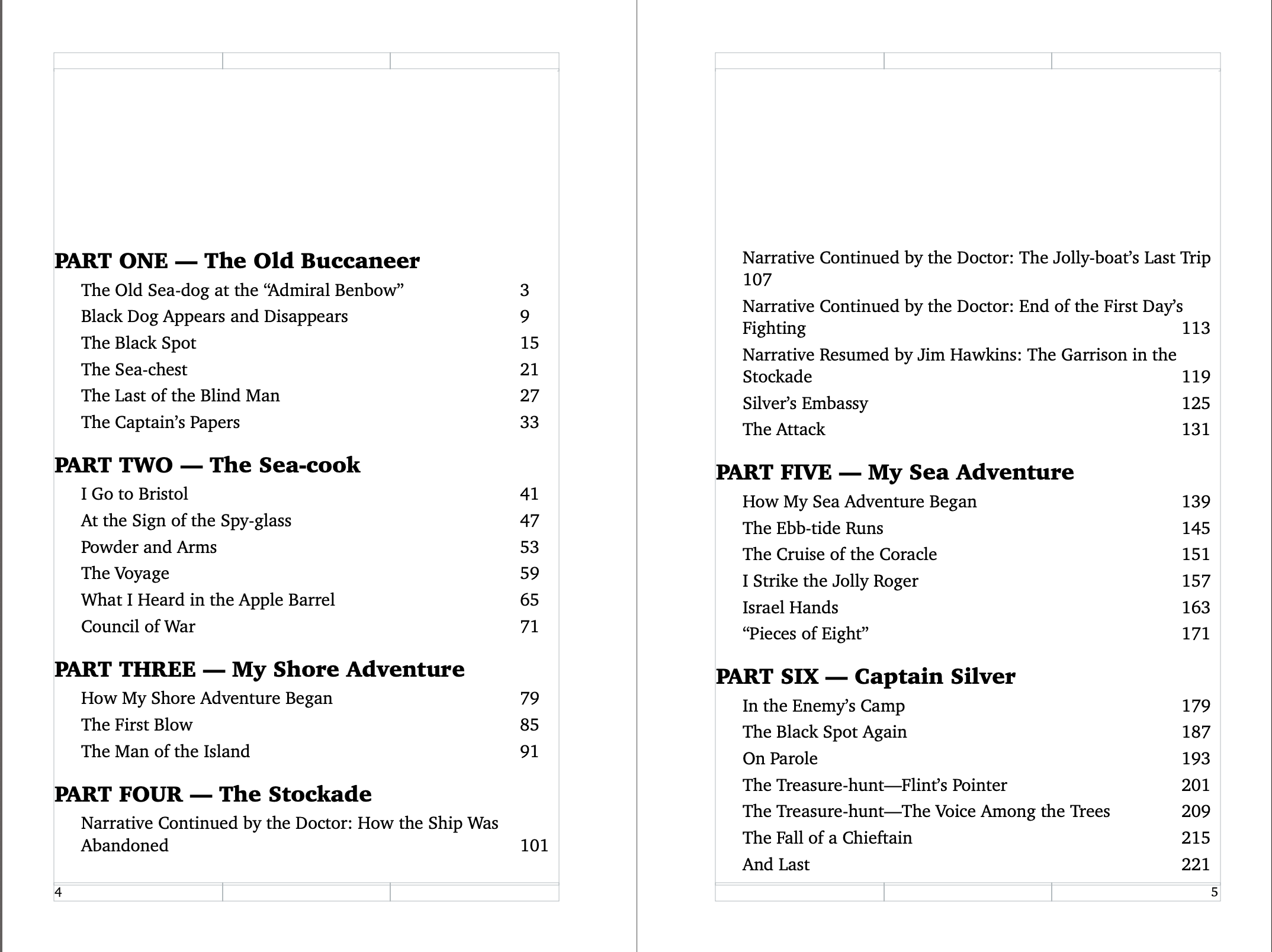
4. Adding a table of contents
Technically adding the table of contents can come before adding pages numbers, but that always seemed silly to me to have a table of contents that references page numbers that can’t be seen. At any rate, this is when I add in the table of contents.
First, I place my cursor in the spot where I’d like for the table of contents to be added. Then I go to Insert > Table of Contents > Document. This will add a table of contents that includes all of the paragraph styles that I specify from the entire document. A table of contents can also be generated at a section level, or until the next occurance of a table of contents.
The styles for the table of contents are changed a little differently - they don’t have explicit paragraph styles applied to them, but if you change one level it will change all of the other titles at that same level too.
The screenshot below shows what my table of contents looks like after it is styled.
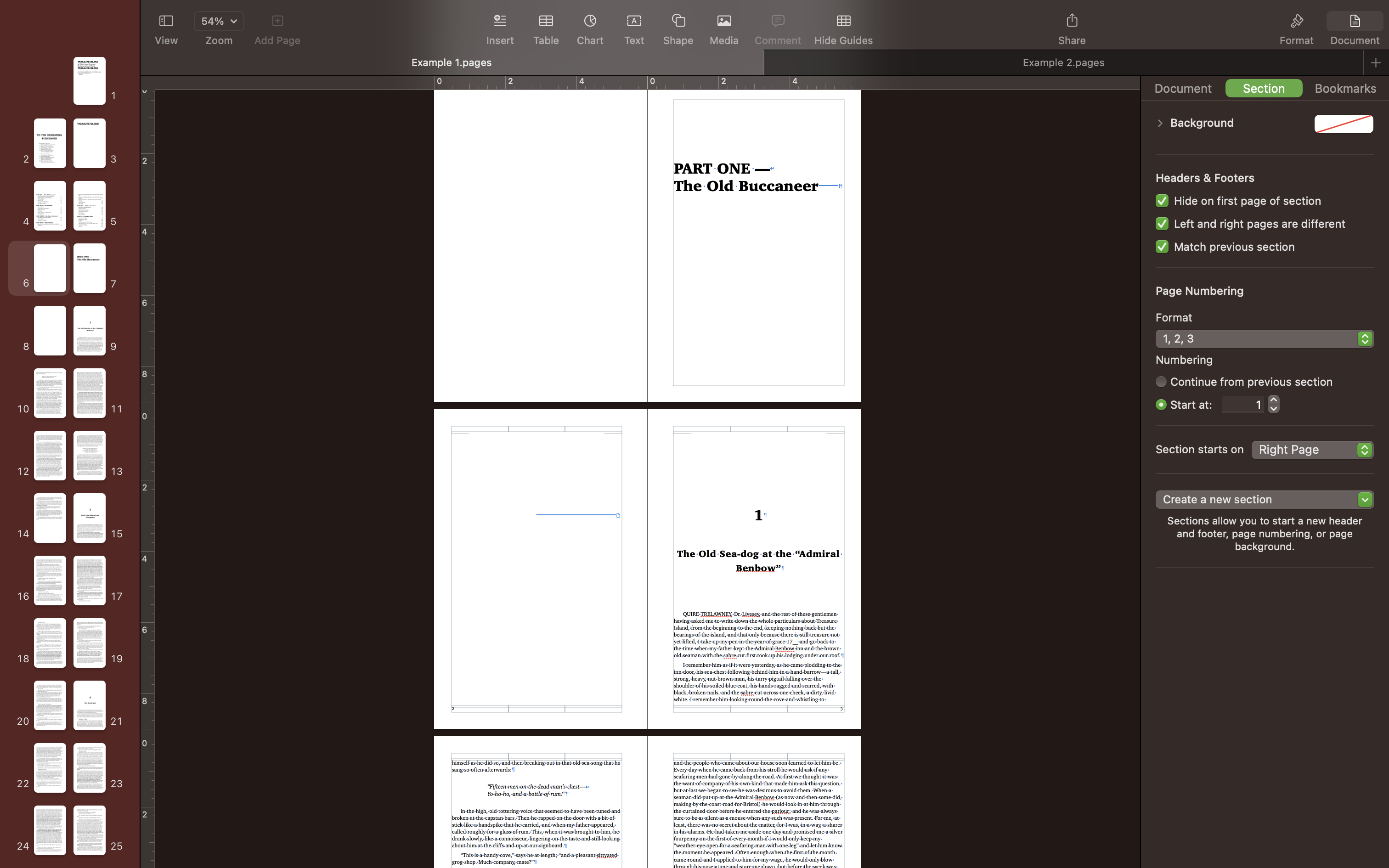
5. Using sections
Usually after adding in a table of contents I remember that I don’t want page one to start on the title page, I want it to start on the first page of primary text. To do this I have to split the book into different sections: one section for the front matter (which I go into more detail later in the article), the primary text (if chapters are grouped in some way, I’ll create a section for each group), and the end matter (also discussed later in this article).
To break the text up into sections, place the cursor directly in front of the text where the new section will begin. Then go to Document (top right corner) > Section > Create new section > Starting with this page. While there is no visual indication or feedback that this worked, a good way to test if it did work is by having the numbering restart at 1 (in the same place Section > Numbering > Start at: 1). If the page number for the page you are on changes to show a 1, that’s a good indication that the book is now divided properly. This also happens to be the way to get the first text page to have the page number “1.”
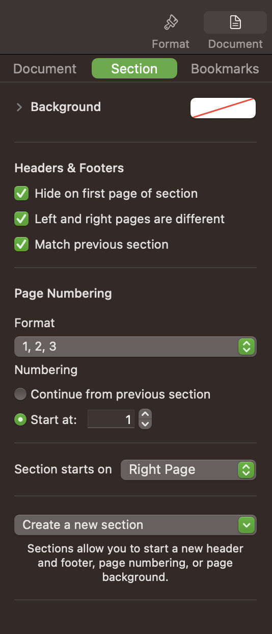
I typically will go to the first section - which now begins with the very first page - and change the number format to lower case roman numerals. So, all my front matter will be labeled with lowercase roman numerals, while the rest of my text will have regular numbers. If I have any back matter, I usually change the number format to uppercase roman numerals. I’m honestly not sure if there is some guidance on what is typically used, but that’s what as worked for me.
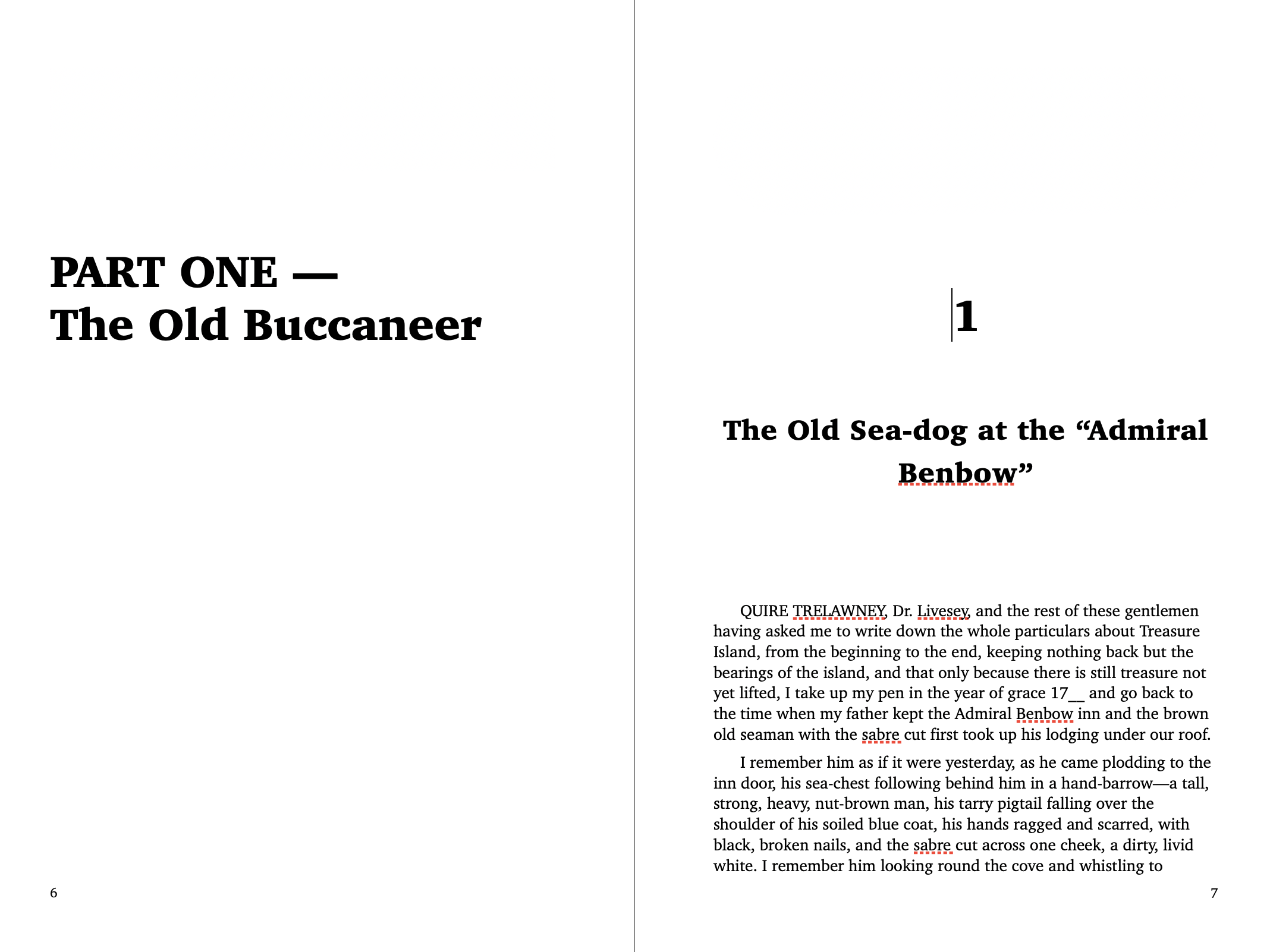
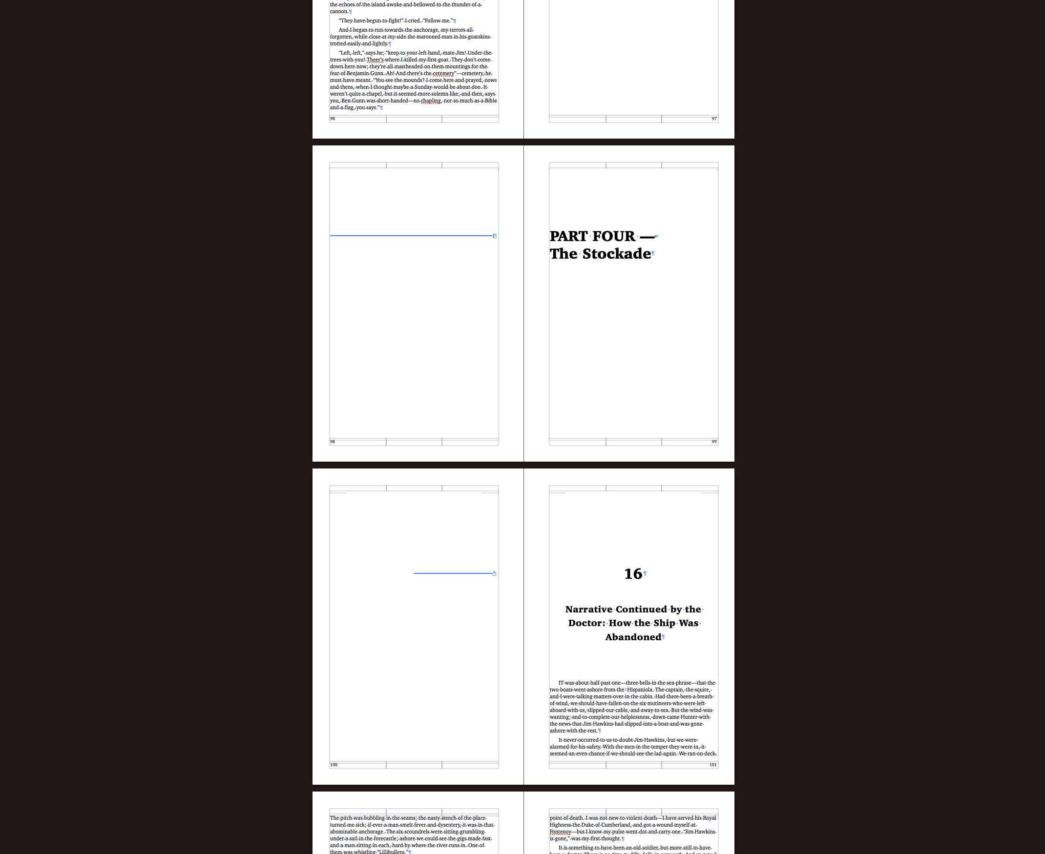
The other thing I like about using sections, especially for grouped chapters within the book, is that I can force new sections to begin on the right-hand page. While not required, especially if the goal is to keep the page count down, I think it elevates the text a little to force all the section starts (and the chapter start) to be on the right hand page. Many books follow this format, and I think it makes finding chapters much easier. Of course, this can result in a lot of blank pages, which can be left blank, but are also a perfect opportunity to show off some artwork related to the text.
6. Managing white space
The primary goal of typesetting is to make the text of the content visually appealing and readable, and while font selection has a lot to do with that, it’s not the only part of making text readable. Those invisible characters that I turned on play an extremely important roll in how easily a reader is able to navigate the text. Here are a few that I use extensively to manage white space.
As I mentioned before, the goal is to get a nice even texture of text across the page that allows the readers eyes to move comfortably from word to word, across line breaks and page breaks - readers shouldn’t have to think about how to read the text.
Before adding in any white space I always delete all of the the return characters in between paragraphs. Instead of double tapping enter to create space between the paragraphs I manage the spacing using the character styles. This gives me much more control over exactly how much space is left between paragraphs.
Character and line spacing
I start by making sure that there is comfortable spacing between each of the words. Most fonts do a good job at the space sizing, but depending on the application I may make the words or letters in the words tighter or looser than the default. In the images the left image shows character spacing at -4%, the center shows at 0 and the right shows the character spacing at 4%.
Then I make sure that the line spacing looks good. Again, below the three images show the difference between a tighter spacing, comfortable spacing and a looser spacing.
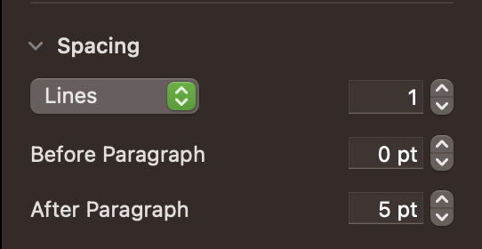
Finally I make sure that the paragraph spacing looks good. And again, below the three images show the difference between a tighter spacing, comfortable spacing and a looser spacing.
While the differences may be subtle in the images above, as you mix the various styles together the text will become very visibly more or less easy to read.
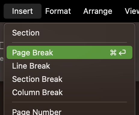
Break characters
There is also several break characters that I like to use to throughout the text to create that easy reading experience. One that I use commonly is the page break character. While creating sections does a relatively good job at getting all of first pages of sections onto the right hand page, within a section some of the chapters may still end up on the left side. This is where I will add a page break character.
I place my cursor where I would like to insert the new character and then go to Insert > Page Break. This will force the following text to begin on the next page.
7. Adding images
I don’t start adding images until I’m mostly happy with the text. Images are large and clunky and cause text to do a lot of reflowing. It’s much easier to get the text in a good place before adding images to the mix. I also like to know if I have any natural spots to place imagery - like next to chapters with a left blank page.
There’s no crazy hoops to jump through to add an image. I tend to just drag and drop the images directly from my folder on my desktop, but there’s also an option to add photos by clicking on Media in the top bar and selecting where you want to import your media from. I keep all of my photos in separate folders under documents, and to import those using the Media menu you click on ... Choose, which will open up the system dialogue box.
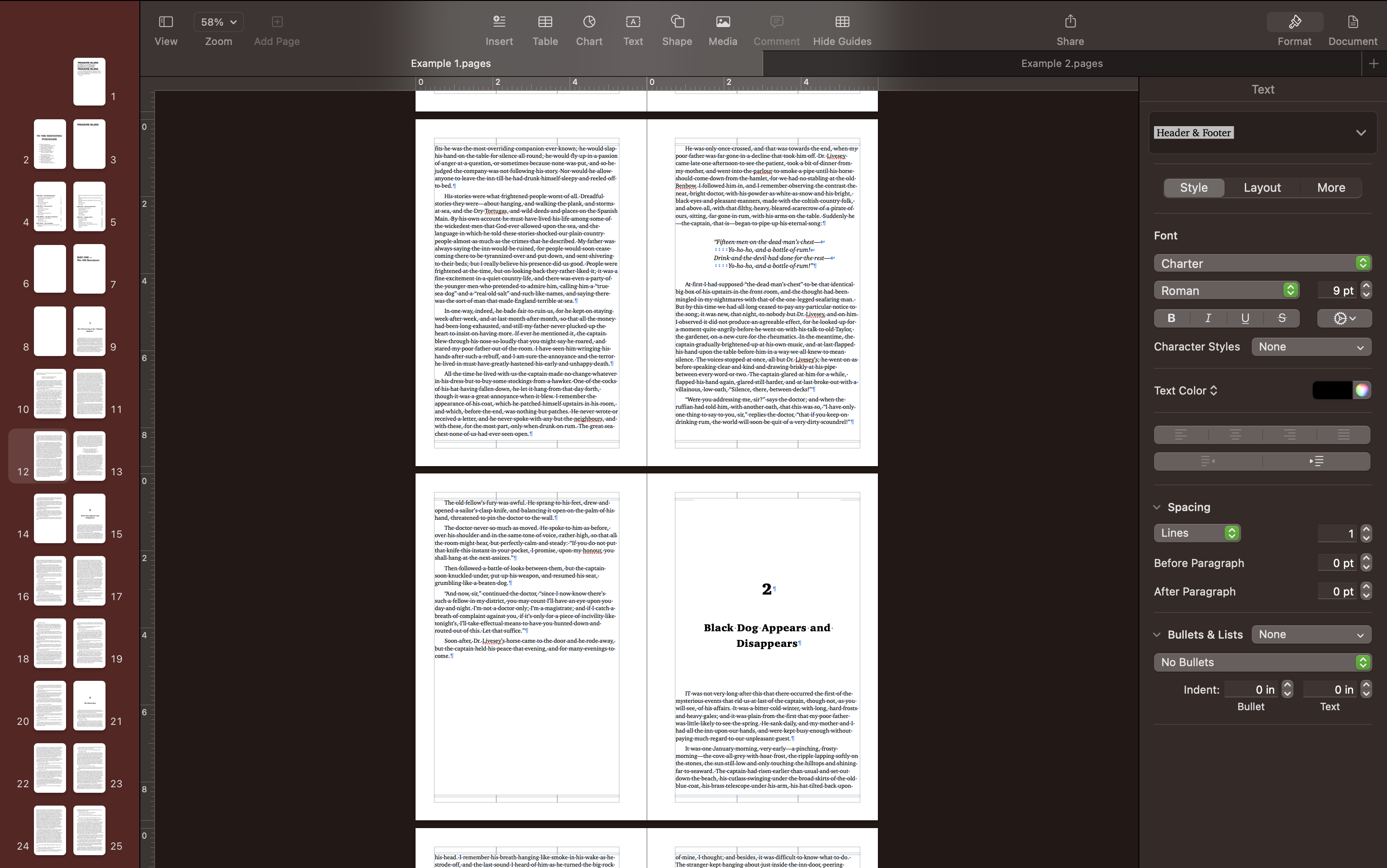
Personally, I like the default settings and spacing for dragging and dropping an image into Pages. It does a nice job of adding space around the image and defaults to the text wrapping around the image instead of passing through it. The only setting that I may change is having the text restricted to only flow above and below the image and not along the sides, especially for smaller books where the text may not have more than 4 or 5 words along the side of the image.
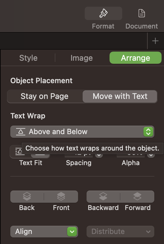
8. Front and End Matter
Up to this point I’ve only focused on formatting the “principle text,” but now I’m ready to format the front and end matter. While some of the pages in the front and end matter seem unnecessary in a personal book, I’ve found that including them as a part of my typesetting elevates my books from “nicely formatted essay” to “officially published book.” While I won’t go into detail about each part I’m this article, I’ve listed them below for reference.
Front matter
- Half title page
- Title page
- Table of contents
- Copyright/legal
- Acknowledgements
- Forward
- Intro
End matter
- Appendix
- Notes
- Glossary
- Bibliography or Reference List
- Index
- Colophon
- Bibliographic Reference
9. Final touches
These final steps are not totally necessary, but, again, they take the text to the next level. I think the time is well worth the effort, especially when I’m planning on printing and binding the book myself - I want it to be perfect!
Other spacing to consider
Additional standards for professional typesetting is to make sure that there are no widowed or orphaned lines of text or orphaned words. These two next steps should be done at the very end, right before exporting for printing. I learned this the hard way and have had to go through several three hundred page books paragraph by paragraph multiple times over redoing these steps because I did them too early in the process.
Lines of text
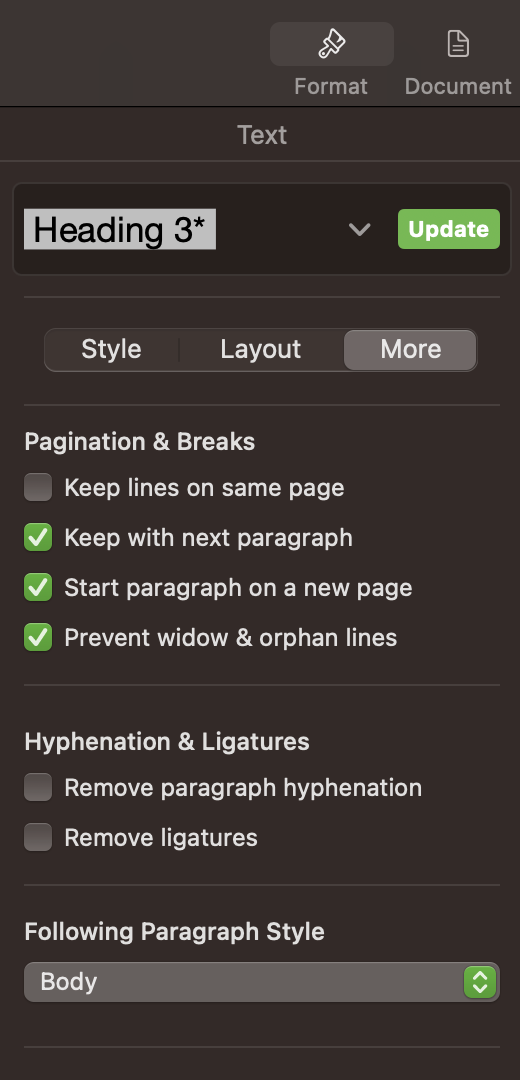
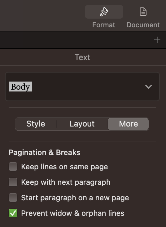
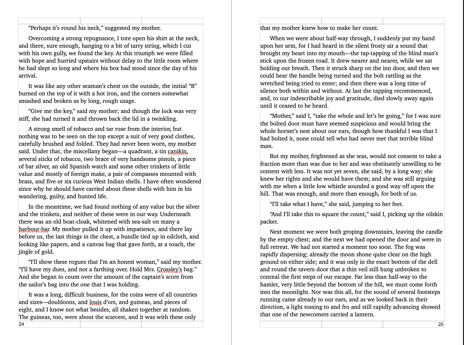
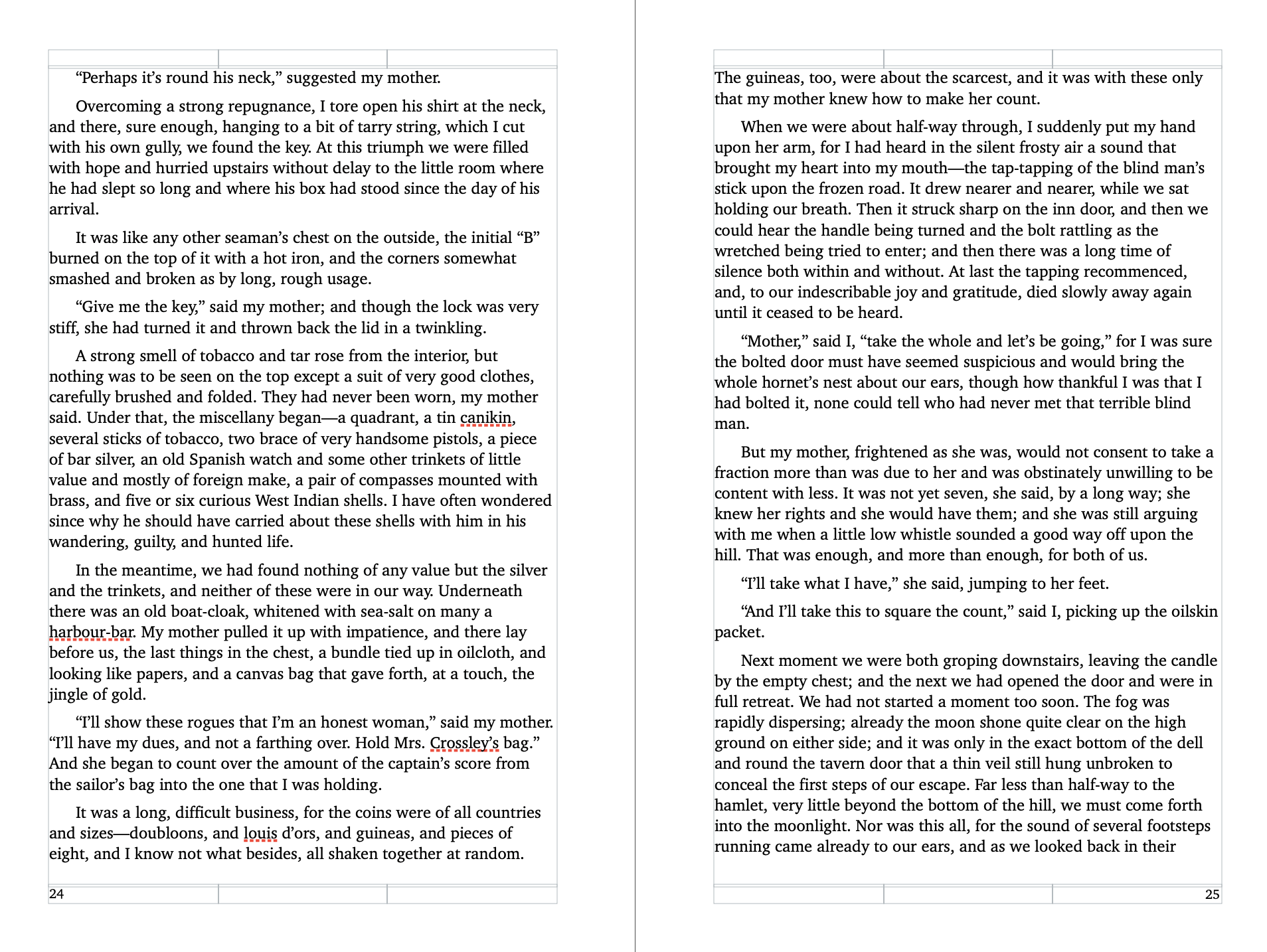
A widow is where the first line of text of a paragraph starts on the preceding page. An orphaned line of text is where the last line of a paragraph continues on the next page. Neither scenario is desired in a professionally typeset book because it makes the paragraphs difficult to read. This is fixed by making sure that if a paragraph must split across pages it has at least two lines of text on each page, or it starts the entire paragraph on the next page.
In Pages it’s easy to manage widows by selecting the body text and going to Format > More > Check the box next to prevent widow and orphan lines. This setting should be set by default, but I always double check. Below shows an example of a paragraph that is split between two pages creating an orphan line. One image is before and one is after this setting is changed.
Words
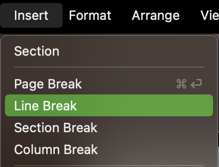
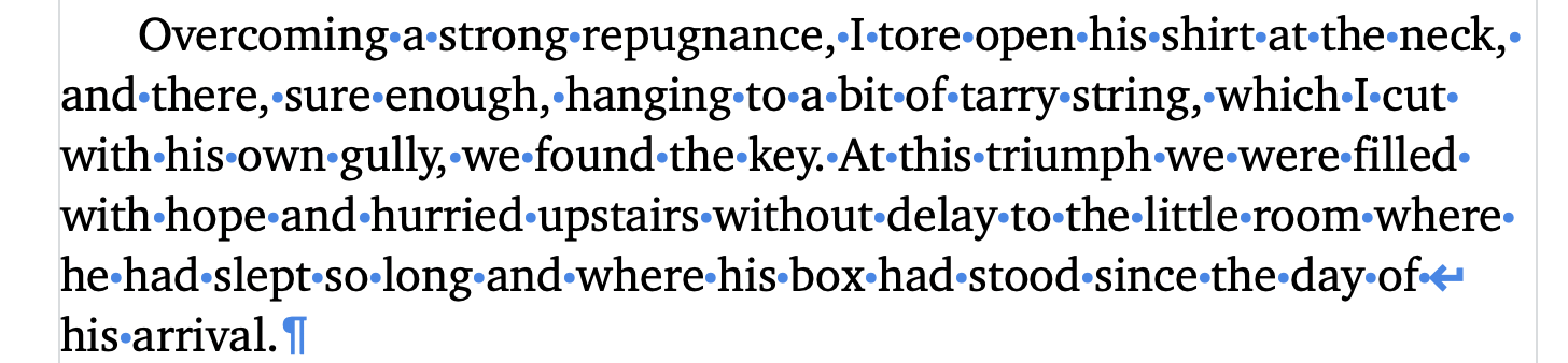
Next are orphaned words. Orphaned words are similar to orphaned lines of text, but in this case there’s a single word in the last line of text in a paragraph. Again, this breaks up the reading experience and should be resolved by forcing at least two words onto the last line of a paragraph. This is much more time consuming to wrangle since it is a completely manual process of going through each paragraph and inserting break characters.
To fix this I start at the very beginning of the text and scroll through each page until I find an orphan. I place my cursor before the words that I want to force onto the last line and then go to Insert > Line Break.

Page count for printing
The last thing I consider before exporting my final PDF for printing is how I plan to structure my signatures and how that affects the final page count. When printing off pages for a book, the number of pages per sheet of paper is in multiples of four - which means that the final page count also should be a multiple of four. Additionally, the sheets folded into folios get stacked together into signatures. The signatures can have anywhere from 3 to ~8 sheets. To keep the number of sheets in each signature even the final page count should also be a multiple of the number of sheets per signature.
page count / 4 = whole number
page count / sheets per signature = whole number
In order to get the page count right, I’ll first go through and see if any pages can be added or removed within the text itself to get to the closest number of pages that works. Then, if it’s still not quite right I’ll add blank pages to both the very beginning and very end until I reach the needed page count.
Conclusion
Typesetting really is an art form that must be practiced over and over again. I’ve had many opportunities to typeset everything from short essays to large and complicated books, and the time and skill really does show through to the final product.
At this point, I’m ready to print of my text for binding. I documented my printing process in a separate article: “Printing Book Signatures on Epson ET-8550.”